Live website
Iyyun
Editorial platform for a philosophy journal
Role: UX/UI, visual identity, web development (end-to-end) · 2021—2023
Iyyun is a long-established bilingual philosophy journal published by the Hebrew University of Jerusalem. Before this project, the journal had no formal online presence, only bi-yearly print issues distributed through academic repositories.
I was selected through a competitive bid to design and build its first digital platform from scratch.
The homepage opens with the Iyyun logo deconstructed into its geometric components. As the cursor moves across the page, these elements shift in and out of alignment, turning the hero into a small interactive space for contemplation before the reader enters the journal itself.
The challenge
The core challenge was designing a system for a journal redefining itself in real time. Its scope was expanding from print to web, from a single academic article format to a growing range of editorial types: academic essays, interviews, video conversations, and formats that hadn't been defined yet.
The architecture could not be built around what the journal was – it had to be built around what the journal might become.
At the same time, the editorial team had no experience with web tools. Whatever I designed had to be intuitive enough for non-technical editors to manage on their own without compromising structural integrity.
Approach
- using the affordances of a digital platform to include video interviews, events, open calls, and special features that cannot exist in the printed journal
- building a CMS structure that could support multiple editorial formats without requiring structural changes each time something new was introduced
- designing for a number of different reading experiences for dense philosophical texts in Hebrew and English
- developing a bilingual framework that could gracefully handle articles published only in one of the languages, or in both as translations
- creating editorial guidelines so the team could confidently manage the system after launch
Throughout the process, I worked closely with the editors to translate evolving editorial needs into a coherent system. Often, this meant interpreting requests framed in terms of layout or content and identifying the underlying structural problem that actually needed to be solved.
Typography and reading experience
Because the journal publishes long-form philosophical writing, readability was central to the design. I chose Fedra Sans, a typeface designed to function consistently across Hebrew, English, and Arabic (a potential future expansion). Its performance and tone at both small and large sizes made it appropriate for long-form academic reading, while maintaining visual continuity between print and digital formats.
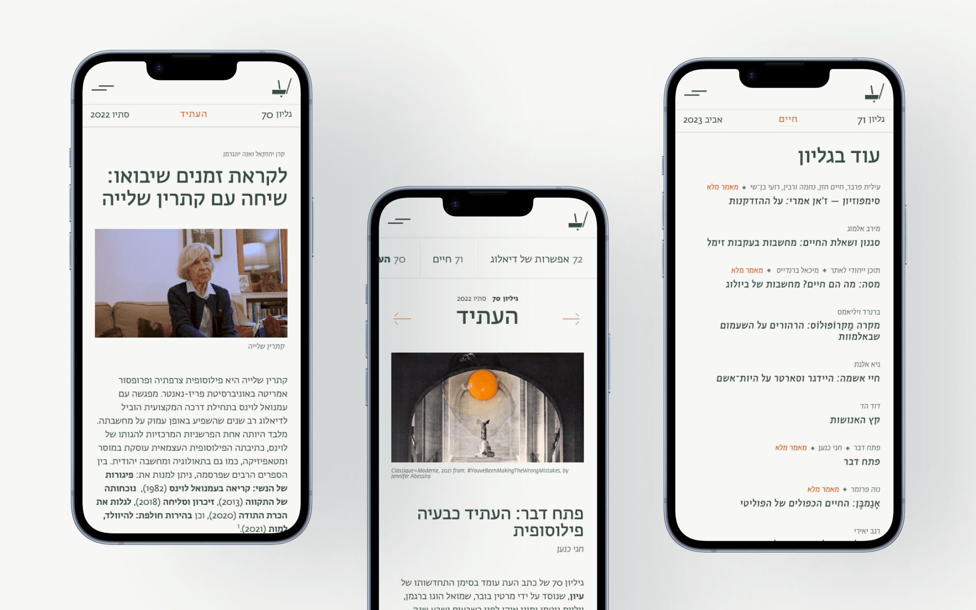
Browsing an article page. Article text is set to a calibrated reading width – aligned to the right or left depending on language direction – and doesn't fill the full page. For a philosophical journal, the space around the text matters as much as the text itself.
Content architecture
The bilingual structure had to handle three content scenarios gracefully: articles that exist only in Hebrew, only in English, or in both languages as translations. Each needed to function naturally within the same system without forcing a rigid template or requiring editorial workarounds.
Beyond language, the CMS had to support a growing range of editorial formats: journal issues with academic articles, but also dialogues, video pieces, and longer essay-form features, without requiring structural changes every time a new type was introduced. I designed the content model to auto-adjust across these variations, so editors could publish new formats without developer involvement.
Rather than forcing uniform thumbnails on the issue page, the layout accommodates both image-based and text-only entries, using that variation to create a more open, non-repetitive rhythm.
Access model
The journal sells print subscriptions through an external platform managed by the parent organization – a constraint I couldn't change. I designed an access model where some articles are available in full on the site while others show only a preview, encouraging print engagement without making the reading experience feel like a paywall. The balance mattered: I didn't want the site to feel like it existed just to sell something, but rather to have value of its own.
Visual language
The visual identity is built around restraint and warmth. The color palette avoids pure black and white, using a warm off-white background, dark green body text, and an earthy red-ochre accent. The palette grounds the site in something natural and quiet, subtle but distinctive without being loud.
Throughout the site, subtle line-work animations, like small arrows and geometric movements, add a sense of craft and intentionality without competing for attention. They're meant to be felt more than noticed.
An arrow tracks the cursor between two CTAs – the previous issue, and the next one, adding a subtle sense of responsiveness to an otherwise quiet interface
How it's held up
I maintained the site for the first year after launch, and created explicit content guidelines to ensure the team could confidently manage uploads after launch without relying on external support. The site is still live and largely unchanged, running on the architecture and content model I originally designed and built.
Since Issue 70 (the first published through the new system), the journal has published six issues (and counting) through the site, with editors managing content independently with minimal technical support, which was the goal from the start.